Sometimes you don’t want to hard-code widths and heights. You want elements that just fit. You need a background that always covers the page, an overlay that scales with its container, or a column that takes up exactly half the parent. CE.SDK supports this through size modes and percent-based sizing, plus a one-liner convenience API that makes a block fill its parent. You set size modes per axis and use 0.0…1.0 values to express percentages; you can then query computed dimensions once layout stabilizes.
Why It Matters for Automation#
When you generate designs in bulk, you can’t manually correct layout differences for each image. Percentage-based sizing and fillParent() guarantee that every inserted asset or background automatically scales to the right dimensions, regardless of its original size or aspect ratio. This ensures reliable layouts and predictable exports in automated pipelines.
What You’ll Learn#
- Make a block fill its parent in one line. This is perfect for backgrounds and overlays.
- Use percent size modes for responsive, predictable layouts.
- Read computed width and height after layout to verify results.
- Switch between absolute and percent sizing modes at runtime.
- Build a responsive background that always fits the page.
When You’ll Use It#
- Full-bleed background images that cover the page.
- Responsive overlays and watermarks that track the parent’s size.
- Adaptive layouts across different screen sizes and orientations.
- Automation workflows that replace assets of different sizes without breaking layout consistency.
Fill the Parent (One-Liner)#
The simplest way to auto-resize is to ask the engine to make a block fill its parent:
import ly.img.engine.Engine
// Make 'block' fill its parent container (resizes & positions).engine.block.fillParent(block)
CE.SDK resizes and positions the block, resets crop values if applicable, and switches content fill mode to .cover if needed to avoid invalid crops.
Good for: Page backgrounds, edge-to-edge color panels, full-page masks.
Percent-Based Sizing (Responsive Layouts)#
For finer control, switch size modes for width and height to SizeMode.PERCENT, then assign values from 0.0 ... 1.0:
import ly.img.engine.Engineimport ly.img.engine.SizeMode
// 100% width & height (fill parent)engine.block.setWidthMode(block, mode = SizeMode.PERCENT)engine.block.setHeightMode(block, mode = SizeMode.PERCENT)engine.block.setWidth(block, value = 1.0F)engine.block.setHeight(block, value = 1.0F)
In percent mode, 1.0 means 100% of the parent. Use:
SizeMode.ABSOLUTEfor fixed-size elements.SizeMode.AUTOwhen the content determines its own size.
Partial Fill Examples#
import ly.img.engine.Engineimport ly.img.engine.SizeMode
// 50% width, 100% height (e.g., a left column)engine.block.setWidthMode(block, mode = SizeMode.PERCENT)engine.block.setHeightMode(block, mode = SizeMode.PERCENT)engine.block.setWidth(block, value = 0.5F)engine.block.setHeight(block, value = 1.0F)
Great for split layouts, sidebars, or variable-width panels.
Reading Computed Dimensions#
After the engine completes a layout pass, you can read computed dimensions with the standard accessors:
import ly.img.engine.Engine
val width = engine.block.getWidth(block)val height = engine.block.getHeight(block)
These values are available after layout updates. If you query immediately after changes, you might see stale values. Use coroutines to yield or defer the read before querying.
Switching Between Absolute & Percent#
You can toggle sizing modes at runtime to move between fixed and responsive layouts:
import ly.img.engine.Engineimport ly.img.engine.SizeMode
// Fixed (absolute) sizingengine.block.setWidthMode(block, mode = SizeMode.ABSOLUTE)engine.block.setHeightMode(block, mode = SizeMode.ABSOLUTE)engine.block.setWidth(block, value = 400.0F)engine.block.setHeight(block, value = 300.0F)
// Back to responsive sizingengine.block.setWidthMode(block, mode = SizeMode.PERCENT)engine.block.setHeightMode(block, mode = SizeMode.PERCENT)engine.block.setWidth(block, value = 0.75F) // 75% widthengine.block.setHeight(block, value = 1.0F)  // 100% height
Use absolute for fixed-size exports or print layouts, and percent for responsive layouts or template-based automation.
Practical Example: Responsive Background#
Here’s a common pattern. Create a background that always fills the page:
import ly.img.engine.Colorimport ly.img.engine.DesignBlockTypeimport ly.img.engine.Engineimport ly.img.engine.FillTypeimport ly.img.engine.ShapeTypeimport ly.img.engine.SizeMode
// 1) Create a graphic block and set its fillval bg = engine.block.create(DesignBlockType.Graphic)val shape = engine.block.createShape(ShapeType.Rect)engine.block.setShape(bg, shape = shape)
val solidColor = engine.block.createFill(FillType.Color)val rgbaGreen = Color.fromRGBA(r = 0.5F, g = 1.0F, b = 0.5F, a = 1.0F)engine.block.setColor(solidColor, property = "fill/color/value", color = rgbaGreen)engine.block.setFill(bg, fill = solidColor)
// 2) Append to the page and send behind other contentengine.block.appendChild(parent = page, child = bg)engine.block.sendToBack(bg)
// 3) Either the one-liner:engine.block.fillParent(bg)
// 4) Or, percent-based equivalent:engine.block.setWidthMode(bg, mode = SizeMode.PERCENT)engine.block.setHeightMode(bg, mode = SizeMode.PERCENT)engine.block.setWidth(bg, value = 1.0F)engine.block.setHeight(bg, value = 1.0F)
The percent-based alternative mirrors the behavior of fillParent if your content and crop are already valid. The fillParent method guarantees coverage and sets a safe fill mode automatically.
Automation Example: Batch Image Replacement#
This automation scenario generates name tags:
- Each tag has a dedicated container that:
- Is called hero-frame.
- Displays the person’s photo.
- The code prepares hero-frame once so it always fills its parent.
- It replaces the image fill inside hero-frame during batch generation.
- Layout stays stable regardless of the photo’s size and aspect.
Prepare Once#
import ly.img.engine.DesignBlockTypeimport ly.img.engine.Engineimport ly.img.engine.FillTypeimport ly.img.engine.ShapeType
// One‑time setup when building the template/sceneval heroFrame = engine.block.create(DesignBlockType.Graphic)val rect = engine.block.createShape(ShapeType.Rect)engine.block.setShape(heroFrame, shape = rect)
// Give it a name for easy lookup in later steps / debuggingengine.block.setString(heroFrame, property = "name", value = "hero-frame")
// Attach an image fill now (can be a placeholder)val heroFrameImageFill = engine.block.createFill(FillType.Image)engine.block.setFill(heroFrame, fill = heroFrameImageFill)
// Place it in the nametag layout once (e.g., inside a card group or page)engine.block.appendChild(parent = faceGroup, child = heroFrame)
// Make the container auto‑resize to its parent so the photo always fitsengine.block.fillParent(heroFrame)
Update During the Batch#
At a later time, when the batch runs, it:
- Gets a reference to the
heroFrameblock - Calls a function to update the image fill during each pass.
import ly.img.engine.Engineimport ly.img.engine.FillType
fun replaceHeroPhotoURL(engine: Engine, hero: Int, url: String) {    try {        // Try to get the current fill and swap the image on the same object        val fill = engine.block.getFill(hero)        engine.block.setString(            fill,            property = "fill/image/imageFileURI",            value = url        )    } catch (e: Exception) {        // If no fill exists yet, create and attach one        println("No fill found on hero-frame; creating new fill.")        try {            val newFill = engine.block.createFill(FillType.Image)            engine.block.setString(                newFill,                property = "fill/image/imageFileURI",                value = url            )            engine.block.setFill(hero, fill = newFill)        } catch (e: Exception) {            println("Failed to attach new fill: ${e.message}")        }    }}
Because heroFrame used fillParent, every image conforms to its parent’s size, ensuring layouts remain consistent. This approach is ideal for:
- Product catalogs
- User-generated templates
- Any workflow where image dimensions vary widely.
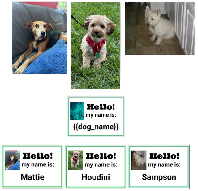
In the preceding diagram, three input images are of different sizes. The engine crops and resizes them to fill the placeholder during the batch.
Complete Example#
Here’s a complete example demonstrating auto-resize in a template-based workflow:
import android.content.Contextimport kotlinx.coroutines.CoroutineScopeimport kotlinx.coroutines.Dispatchersimport kotlinx.coroutines.launchimport ly.img.engine.Colorimport ly.img.engine.DesignBlockTypeimport ly.img.engine.Engineimport ly.img.engine.FillTypeimport ly.img.engine.ShapeTypeimport ly.img.engine.SizeMode
fun autoResizeExample(    context: Context,    license: String,    userId: String) = CoroutineScope(Dispatchers.Main).launch {    val engine = Engine.getInstance(id = "ly.img.engine.autoresize")    engine.start(license = license, userId = userId)    engine.bindOffscreen(width = 1080, height = 1920)
    try {        // Create scene and page        val scene = engine.scene.create()        val page = engine.block.create(DesignBlockType.Page)        engine.block.appendChild(parent = scene, child = page)        engine.block.setWidth(page, value = 1080F)        engine.block.setHeight(page, value = 1920F)
        // Create a full-bleed background using fillParent        val background = engine.block.create(DesignBlockType.Graphic)        val bgShape = engine.block.createShape(ShapeType.Rect)        engine.block.setShape(background, shape = bgShape)
        val bgFill = engine.block.createFill(FillType.Color)        val bgColor = Color.fromRGBA(r = 0.2F, g = 0.4F, b = 0.8F, a = 1.0F)        engine.block.setColor(bgFill, property = "fill/color/value", color = bgColor)        engine.block.setFill(background, fill = bgFill)
        engine.block.appendChild(parent = page, child = background)        engine.block.sendToBack(background)        engine.block.fillParent(background)
        // Create a 50% width left column using percent sizing        val leftColumn = engine.block.create(DesignBlockType.Graphic)        val leftShape = engine.block.createShape(ShapeType.Rect)        engine.block.setShape(leftColumn, shape = leftShape)
        val leftFill = engine.block.createFill(FillType.Color)        val leftColor = Color.fromRGBA(r = 1.0F, g = 0.8F, b = 0.2F, a = 0.8F)        engine.block.setColor(leftFill, property = "fill/color/value", color = leftColor)        engine.block.setFill(leftColumn, fill = leftFill)
        engine.block.appendChild(parent = page, child = leftColumn)
        // Set to 50% width, 100% height        engine.block.setWidthMode(leftColumn, mode = SizeMode.PERCENT)        engine.block.setHeightMode(leftColumn, mode = SizeMode.PERCENT)        engine.block.setWidth(leftColumn, value = 0.5F)        engine.block.setHeight(leftColumn, value = 1.0F)        engine.block.setPositionX(leftColumn, value = 0F)        engine.block.setPositionY(leftColumn, value = 0F)
        // Create a 50% width right column        val rightColumn = engine.block.create(DesignBlockType.Graphic)        val rightShape = engine.block.createShape(ShapeType.Rect)        engine.block.setShape(rightColumn, shape = rightShape)
        val rightFill = engine.block.createFill(FillType.Color)        val rightColor = Color.fromRGBA(r = 0.2F, g = 1.0F, b = 0.4F, a = 0.8F)        engine.block.setColor(rightFill, property = "fill/color/value", color = rightColor)        engine.block.setFill(rightColumn, fill = rightFill)
        engine.block.appendChild(parent = page, child = rightColumn)
        // Set to 50% width, 100% height, positioned on the right        engine.block.setWidthMode(rightColumn, mode = SizeMode.PERCENT)        engine.block.setHeightMode(rightColumn, mode = SizeMode.PERCENT)        engine.block.setWidth(rightColumn, value = 0.5F)        engine.block.setHeight(rightColumn, value = 1.0F)        engine.block.setPositionX(rightColumn, value = 540F) // 50% of 1080        engine.block.setPositionY(rightColumn, value = 0F)
        // Read computed dimensions        val leftWidth = engine.block.getWidth(leftColumn)        val leftHeight = engine.block.getHeight(leftColumn)        val rightWidth = engine.block.getWidth(rightColumn)        val rightHeight = engine.block.getHeight(rightColumn)
        println("Left column: ${leftWidth}x${leftHeight}")        println("Right column: ${rightWidth}x${rightHeight}")
        // Switch left column to absolute sizing        engine.block.setWidthMode(leftColumn, mode = SizeMode.ABSOLUTE)        engine.block.setHeightMode(leftColumn, mode = SizeMode.ABSOLUTE)        engine.block.setWidth(leftColumn, value = 400F)        engine.block.setHeight(leftColumn, value = 800F)
        println("Left column after switching to absolute: ${engine.block.getWidth(leftColumn)}x${engine.block.getHeight(leftColumn)}")
    } finally {        // Note: Don't stop the engine here if you want to keep using it        // engine.stop()    }}
Platform Notes & Limitations#
- Computed dimensions are asynchronous. Read them after a layout cycle. If you set percent sizing and immediately call
getWidth, you may get the previous value. - Groups vs. children. Percent sizing relates a child to its direct parent. Ensure your block is appended where you expect before reading dimensions.
- Fills and crops.
fillParentmay reset crop values and/or set fill mode to cover to avoid invalid states.
Troubleshooting#
| Symptom | Likely Cause | Fix |
|---|---|---|
| Block doesn’t resize with parent | Width/height modes aren’t set to SizeMode.PERCENT | Set setWidthMode(SizeMode.PERCENT) / setHeightMode(SizeMode.PERCENT) and assign 0…1 values. |
Computed width/height are 0 or stale | Reading before layout settled | Defer reads; yield before getWidth/Height. |
| Only one axis resizes | Only one axis set to SizeMode.PERCENT | Set both axes to SizeMode.PERCENT (or use fillParent). |
| Unexpected crop after fill | fillParent adjusted crop/fill mode | Use percent sizing manually if you need to preserve a crop. |
| Child ignores parent size | Wrong parent in hierarchy | Verify appendChild target and recheck computed dimensions after update. |
Next Steps#
You can use auto-resize as you create compositions and make responsive designs. Here are some other guides to explore to deepen your understanding.
- Resize blocks (manual) — control dimensions interactively.
- Batch Processing — automate design generation at scale.
- Multi-Image Generation — generate multiple variants from templates.