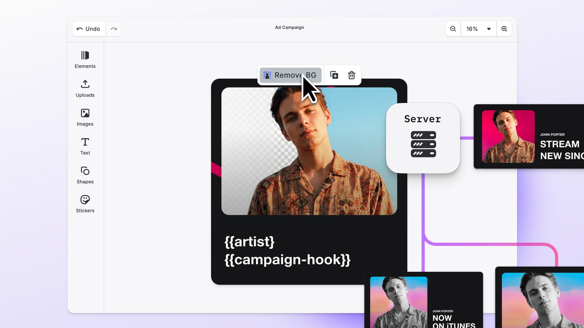
However after maintaining and using our system day in day out we faced a series of problems, and annoyances:
Naming
When I first started working on the code of our app after designing the application for over one year, it struck me to see the naming was not at all related to the one we used in our sketch files.
Naming conventions on the design part had no effect on the ones defined by our developers and vice versa. This makes an effective theming impossible with no clear reference to each color and coordinating style changes so much harder.
Theming
This brings me to theming. Our product — PhotoEditor SDK — is used in a variety of environments. Most of customers want to adapt the editor to their own CI, therefore it has to work in multiple color themes and screen resolutions. Icons and all other assets like illustrations should then adopt to the theme and display accordingly. In the past one created multiple sketch files to accommodate themes, each one relying on its own atomic and component level library. Naming had to be kept in sync and each change in one file had to be applied to the individual themes.
Style Creation
We adopted the convention of creating atomic styles in a separate sketch library file. However the sketch component style creation is cumbersome and repetitive:
- each text style needs 3 versions for left, center and right alignment
- shadows and outlines variations need to be created for each radius used inside the app, since they can’t be masked
- outline and fill style need to be kept in sync manually
Solution
We propose a “Atomic Design-Developer System”. This system lives in one JSON file, that gets accessed by developers and designers alike, through any imaginable input (web interface, editor, sketch plugin). From this JSON file, the application then generates styles for all code bases and a sketch library file with a visual representation of the styles and a page with all atomic symbols. On the sketch part the above described problems get solved in the following way:
Naming
By giving the generated symbols the same name as the JSON path, developers and designers work with the same vocabulary.
“theme.color.navigation” → “Fill / Color / Navigation”Theming
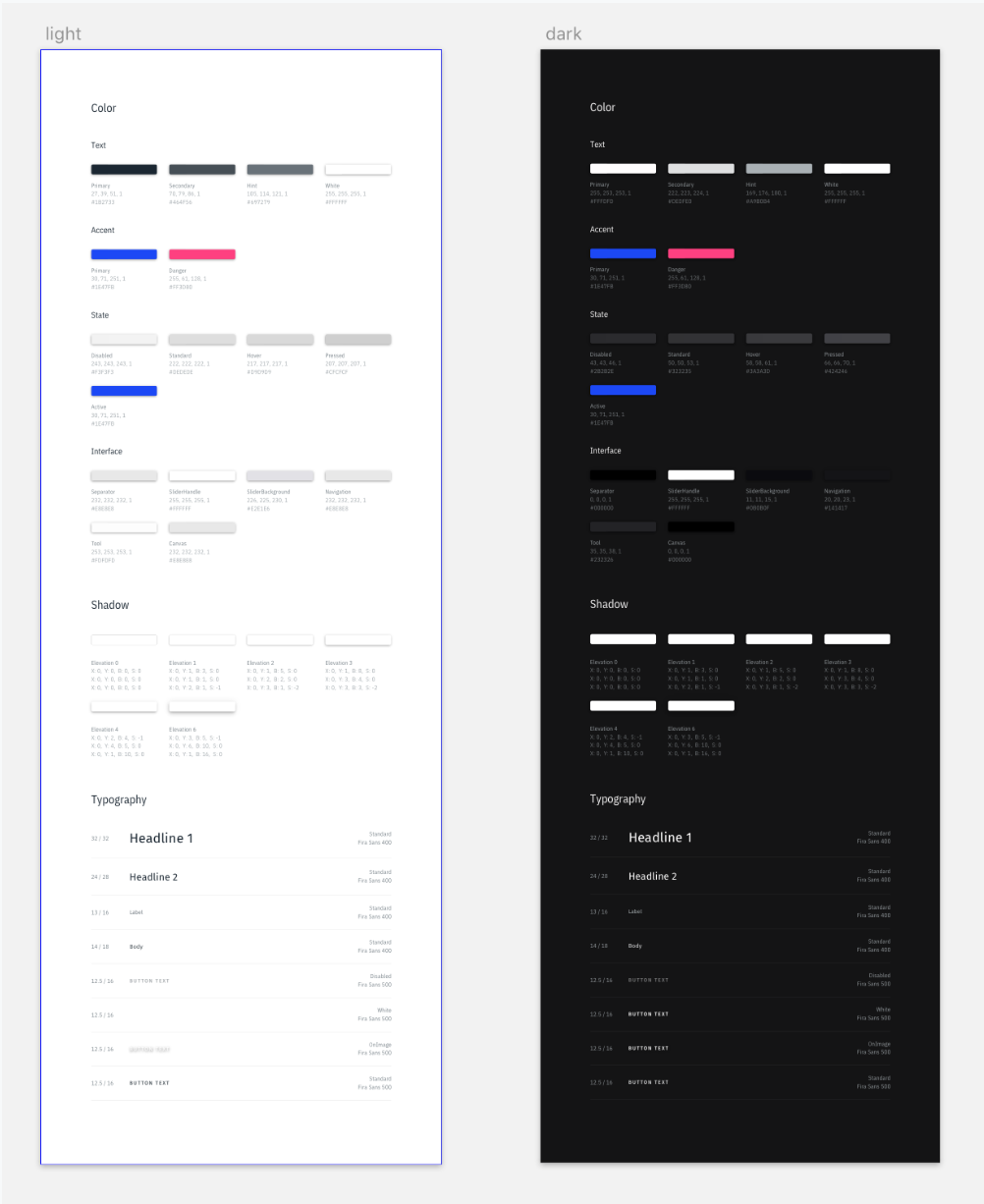
With the simple switch of a constant the theme can be switched. No more multiple screens for each theme. The themes can be compared side by side, without unnecessary clutter of the generated variations for each style, like right and center alignment for typography. Those variations get saved in a separate symbol page.
Style Creation
For each color and shadow variations in outline and radius are generated.The radius and line weight is defined globally and generated for each style.

The same holds true for typography. For each style a symbol for left, centerand right alignment is generated. Also we allow extending text styles. The generated symbols then inherit from the base style. Think bold, italic versions of a text style, or button text on an image background.
Conclusion
We started integrating the generator in our process and are very happy with the results. No more naming conflicts and better communication. We would also like to thank the people behind React Sketchapp, which made this project possible in the first place.
You can download the project here.
Thanks for reading! To stay in the loop, subscribe to our Newsletter.


