A few years back, a close friend came by with a presentation she had prepared for a marketing campaign. Overenergized by this career-boosting assignment, she had nothing else on her mind for weeks, barely reachable and always stressed out. When she finally popped out of her little bubble, you could feel how proud she was, presenting me her latest draft with a gleam in her eyes. She knew that I’m a very visual guy, so she asked for my opinion.
While I could see the enormous amount of work she put into research, structure and storytelling, most of its brilliance was shaded by its design — or better, non-existing design. Oversaturated images, logos placed maliciously in the middle of nowhere, no concept of harmonic paddings, margins or color palettes. As a consequence, the visual presentation was an emotional flatline, to put it mildly. Slide after slide, I was in a constant struggle of ’should I tell her’ or not.
If you’re a designer, you might be familiar with this feeling. Your trained eyes can be a true pain in the ass, often triggering discomfort whenever something is unbalanced, or, let’s say, lacks a certain design attitude. In the digital world, with each ad, presentation, website or user interface you come across, there lurks an urge to set things straight, like with a crooked frame on the wall. While some might argue that this can quickly end in an unhealthy compulsiveness, to some degree this is important. Good design is an essential ingredient to the effectiveness of the underlying medium. After all, your design is the packaging for your content, for your message, and as such, it deserves equal attention. When done right, its true power unfolds with emotions; it can make people feel excited, and most importantly, it can create desirability. In the end, it’s the perfect tool to maximise the impact of your message and let your work truly stand out. But heck, enough with design philosophy.
Back at my friend’s computer, I suggested a few visual changes to the presentation, asking her to choose other fonts, pick different colours, change some pictures, and add more consistency to the layout. She did most of the changes herself following instructions and simple questions, which gave her a sense of ownership over the design.
Looking back, it was two things that were really frustrating me. On the one hand it’s my conviction that a marketeer should know the basic principles of design. You’re responsible for communication, and design is an important tool to shape it and helps to rise above the noise. On the other hand, it was also the tools she’s been using for the presentation and assets that were responsible for that mess. Tools made for designers, so a designer can craft the most beautiful visuals, seem powerless in the hands of a novice. Even business tools like Powerpoint do so little to educate and empower their users to create good design. Time after time, I’ve seen how marketeers, coders, product managers and business managers across industries had to rely on design departments or just struggled with their own mediocre design skills.
Who could have known that this frequent observation would help us pave the way for our own product. In our early days, when we built the first versions of the PhotoEditor SDK, we focused on helping developers to add basic photo editing functions to their products. With non-destructive editing and handling of multiple elements of the canvas we expanded our editor beyond photography — to a design tool.
Once we had all the essential functions in place, we started looking at every tool, from text over brush to adjustments from different angles. The most essential question was: how can this tool deliver beautiful output to those who lack design expertise? To those who don’t really know what character spacing is, or to the ones that don’t really understand what clarity does to an image and what it’s good for.
We believe in the vast potential of democratising design, and digital design starts with an editor.
Our journey towards that goal has just started. In April, we have launched a novel text design tool that makes text layouting a breeze. Our app Portrait showcases how we can generate beautifully designed portraits instantly and has already been downloaded over a Million times. There is much more to come, with tons of ideas, prototypes and data in our backpack.
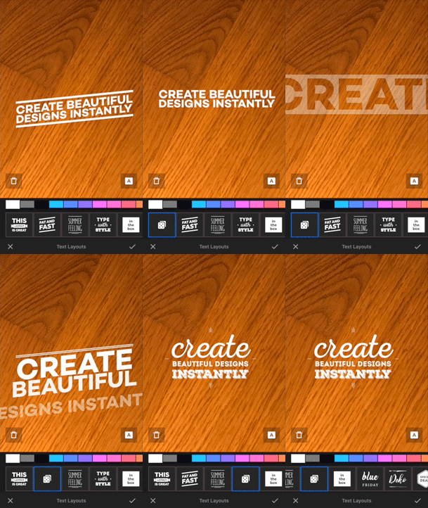
Of course, making our vision happen is tremendously challenging from a UI perspective, and again, it is the quality of the design that will make the difference. As editing is a process that spans platforms, use cases and mediums — I consider this job a true boss fight for every designer. A huge challenge with a huge accomplishment in return, provided that we’re able to pull it off.
So, if you happen to be a designer, and feel the itching in your fingertips, just shoot us an email. Let’s start a conversation, and once you join our team let’s shape the future of design.
Thanks for reading! To stay in the loop, subscribe to our Newsletter.

