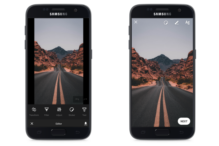
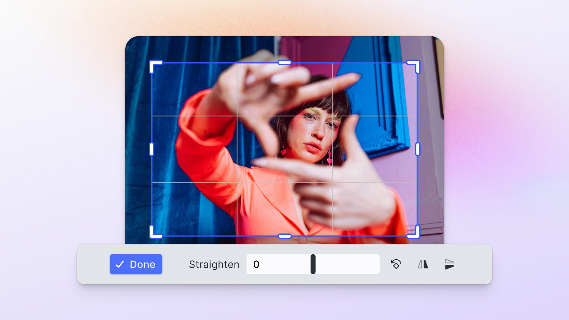
Is it possible to completely rejig the UI of the PhotoEditor SDK within a day? Principally, everything is possible, however, for me as a prospective Java developer this whole undertaking seemed rather tough at first. The task at hand was to rebuild the SDK’s UI to match popular apps like Snapchat or Instagram Stories in only a few steps. A few weeks ago, we already did something similar with the iOS SDK, however, as there are some differences between the platforms the whole process had to be repeated for Android.

As my colleague Malte Baumann already pointed out in his blog post, the main idea behind this endeavor is to explore the possibilities and limitations of the SDK’s customizable UI. But above that, it is also a great way of making oneself familiar with the SDK’s architecture and functionalities. Below, I’m going to explain some of the technical aspects as well as the setup of the story UI in a little more detail.
The Architecture
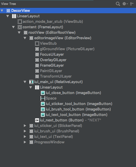
The interface is composed of several layers. The first layer is the EditorRootView that contains all other views and is, therefore, their parent object. Beneath that lies the EditorPreview that is responsible for the display of the selected image. Following comes the BrushLayer that can be drawn upon. In this specific layer array, the brush cannot be placed in front of a sticker. The stickers, however, are all generated in dedicated layers which makes it easy to adjust their order. Once selected, a sticker will automatically be brought to the front. The UI elements can be switched visible and invisible at will; they lie at the very top so that no sticker can cover them.
At the heart of the UI lies the StateHandler that functions as the communication interface with the SDK. The StateHandler includes the EditorShowState and the HistoryState. The HistoryState allows for the retrieval of methods that are necessary for the function of the “undo” button. For example, every new brush stroke adds a new memory state that can be retrieved by the HistoryState and hence reversed. The EditorShowState manages the EditMode that allows for the activation of the different SDK tools. To draw with the brush tool, the EditMode simply has to be set to brush. Color and stroke width are then controlled by the BrushLayerSettings.
There is a dedicated button to add emojis that displays a RecyclerView filled with every sticker available in the config upon press. Once a sticker is selected a new layer with matching StickerLayerSettings is added to the image.
Although text is realized as a sticker as well within the SDK, it is a little more complicated to generate a text sticker as the required TextStickerConfig has to be generated first. The text tool can create text stickers through keyboard entries. The text and background color, as well as the text alignment, can be adjusted separately. Those functions can be controlled via different buttons. However, as the SDK has no canned methods for these operations, I had to write widgets that control the buttons. The different button states are interpreted and executed in the TextPanel.
To export an image, you simply have to launch the saveImage method.
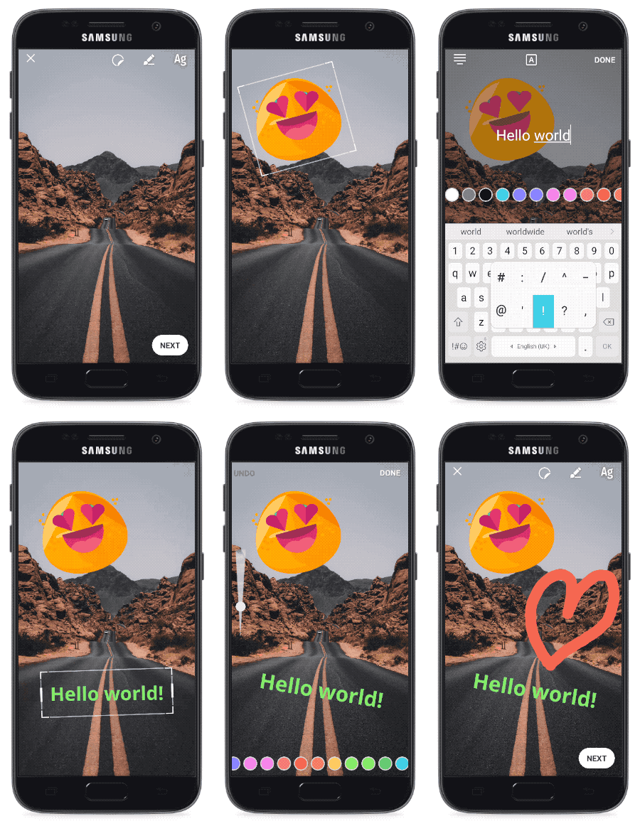
The Result
Thanks to the documentation, the execution of the UI revamp was pretty straightforward even without previous knowledge or source code access. As main functionalities like the brush tool or the undo function are already built into the SDK, it was a manageable task to integrate those into the new UI. Against that, the styling of the SeekBar that is needed to adjust the brush size was a little more time-consuming.
The design was mainly realized through layouts with fairly simple code. Even though there were some minor hurdles to overcome, the allotted time of a working day should be adequate for a more experienced developer.
You can find the code for this example UI in our repository.
Thanks to Felix Rau and Malte Baumann!
Thanks for reading! To stay in the loop, subscribe to our Newsletter.

