
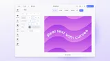
Asset Library
Definition
The UI layer through which users browse, search, and insert assets in the CE.SDK editor. While an asset source defines what content exists at the engine level, the asset library defines how that content is displayed: the visual organization, panel layout, thumbnail grid, navigation hierarchy, and which content appears in which context.
The two are always distinct: registering an asset source makes content available to the engine, but it does not make it visible to users. A library entry must also be configured for the source to appear in the UI.
How the Three-Component Chain Works
The asset library is assembled from three cooperating components, each with a distinct role.
Asset Source
Registered with the engine. Provides the data. Has no presentational properties of its own.
An asset source makes content available to the engine, but not to users. It is invisible in the UI until a library entry references it.
Library Entry
Registered with the editor UI. References one or more asset sources by ID and defines how their content is displayed: grid columns, item height, thumbnail background type, preview row length, icon, and label at each level (entry, source, group).
A single entry can reference multiple sources, and a source can be referenced by multiple entries, allowing the same content to appear in more than one panel. Creating a library entry alone is not sufficient: it must also be added to the dock order before it becomes visible.
Dock Button
References one or more library entries by ID and opens them when clicked. The dock button takes entry IDs, not source IDs directly.
If a referenced entry does not exist, the button does not appear. This separation is intentional: entries can be registered at initialization but shown conditionally depending on role, scene mode, or other context.
Panel Behavior and Placement
Positioning
The asset library panel can be positioned on the left or right side of the canvas, or configured to float over the canvas for compact layouts. On mobile, the panel appears at the bottom of the screen.
It can be set to close automatically after an asset is inserted (the default for replace operations) or to remain open.
Insert vs. Replace Context
The library has two operational contexts: insert (opening a library to add new content to the scene) and replace (opening a library specifically to swap the content of a selected block).
Replace libraries are configured separately and are context-aware: the entries shown depend on the block type and fill type of the currently selected block. An image placeholder surfaces only image-compatible sources; a video block surfaces only video-compatible sources. The replace button can be hidden entirely for specific block types by returning an empty entry list for that context.
Customization
Default library entries covering images, stickers, shapes, filters, fonts, templates, audio, and video ship with CE.SDK and can be modified, reordered, relabeled, or removed.
A custom source can be appended to an existing entry (for example, adding a brand image library to the default Images panel so both appear in the same tab) rather than always requiring a new dedicated panel. Custom entries support theme-aware icons that automatically update when the editor switches between light and dark mode.
Labels are provided through the i18n translation system at three levels: the entry label shown in the dock and panel header, the source label within a multi-source entry, and the group label within a source that contains categories.
A single library entry can reference multiple asset sources, and a single asset source can appear in multiple library entries. This makes it possible to surface brand assets in both a dedicated “Brand” panel and alongside stock content in a general “Images” panel, with no duplication of source configuration.
Available Asset Sources at a Glance
Content that can be surfaced through the asset library UI.
CE.SDK ships with built-in sources covering:
- Images, stickers, shapes, and vector paths
- Filters (LUTs) and color palettes
- Fonts and typefaces
- Templates (design, social, print, presentation)
- Crop presets and page presets
- Upload (user-supplied content)
- Audio and video clips
Documented third-party integrations and custom connection patterns:
Unsplash
Free high-resolution stock photography.
Pexels
Free stock photos and videos.
Getty Images
Licensed commercial stock photography.
Airtable
Spreadsheet-as-asset-backend for structured content.
Soundstripe
Licensed music and audio tracks.
Custom DAM
Any proprietary content collection (brand DAM, internal media library, or custom CMS) connected as a custom remote source.
IMG.LY Premium Templates
Self-hostable premium template packages available separately from IMG.LY.
For full details on each source, integration requirements, and API access, see Asset Source.
Links
Documentation and references for this concept.
Related Terms
Asset Source
A data provider that supplies a collection of assets (images, videos, fonts, stickers, templates, shapes, or any other a…
Dock
The entry point in the CE.SDK editor UI for accessing assets and tools not tied to a currently selected block, typically…
Plugin
A modular extension registered at editor initialization via cesdk.addPlugin() that adds custom functionality to CE.SDK (…