Text
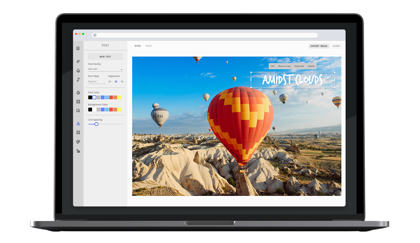
A picture says more than a thousand words, however sometimes it still takes a few more. The robust text feature of PhotoEditor SDK provides all necessary functions for quickly adding text to any picture. The corresponding font library can easily be exchanged or expanded.
Specifying the available fonts#
In order to enable or disable specific fonts, simply pass the fonts option to the text tool configuration. The fonts will be displayed in the order mentioned by the configuration. Here is the list of default fonts.
const editor = await PhotoEditorSDKUI.init({text: {fonts: [{ identifier: 'imgly_font_open_sans_bold' },{ identifier: 'imgly_font_aleo_bold' },{ identifier: 'imgly_font_amaticsc' },{ identifier: 'imgly_font_archivo_black' },{ identifier: 'imgly_font_bungee_inline' },{ identifier: 'imgly_font_campton_bold' },{ identifier: 'imgly_font_carter_one' },{ identifier: 'imgly_font_codystar' },{ identifier: 'imgly_font_fira_sans_regular' },{ identifier: 'imgly_font_galano_grotesque_bold' },{ identifier: 'imgly_font_krona_one' },{ identifier: 'imgly_font_kumar_one_outline' },{ identifier: 'imgly_font_lobster' },{ identifier: 'imgly_font_molle' },{ identifier: 'imgly_font_monoton' },{ identifier: 'imgly_font_nixie_one' },{ identifier: 'imgly_font_notable' },{ identifier: 'imgly_font_ostrich_sans_black' },{ identifier: 'imgly_font_ostrich_sans_bold' },{ identifier: 'imgly_font_oswald_semi_bold' },{ identifier: 'imgly_font_palanquin_dark_semi_bold' },{ identifier: 'imgly_font_poppins' },{ identifier: 'imgly_font_permanent_marker' },{ identifier: 'imgly_font_roboto_black_italic' },{ identifier: 'imgly_font_roboto_light_italic' },{ identifier: 'imgly_font_sancreek' },{ identifier: 'imgly_font_stint_ultra_expanded' },{ identifier: 'imgly_font_trash_hand' },{ identifier: 'imgly_font_vt323' },{ identifier: 'imgly_font_yeseva_one' },],},});
Adding custom fonts#
You can add new fonts to the existing list of items using same configuration interface as above.
PE.SDK does not provide an option to use fonts that are provided by a user's device or browser to avoid possible license infringements. Each font has its license terms and some can not be used for free in a commercial use case.
Text Metrics#
Due to the lack of support for font measurement and precise layouting, the SDK relies on font metrics from the fonts used in the editor. These are provided for all default fonts and can be easily added along with your custom fonts.
WARNING: If you do not provide font metrics for your custom font, the SDK will issue a warning during load and you may experience cut off or jumping text. To quickly collect the required metrics, we recommend the Opentype Font Inspector. Just upload your font file and extract unitsPerEm from the Font Header table, as well as ascender and descender from the Horizontal Header Table.
Adding web fonts#
You can simply add system fonts by specifying their font family, which you would also use in CSS, add the variation's provider option and set it to file. We recommend adding the web fonts as woff files, which have the widest browser support.
const editor = await PhotoEditorSDKUI.init({text: {fonts: [...,{identifier: 'custom-font',fontFamily: 'Custom Font',fontWeight: 400,textMetrics: {unitsPerEm: 2048,ascender: 1919,descender: -409,},fontURI: '..', // path to the font, relative to the font asset directoryformat: 'woff',provider: 'file'}]},})
Adding google fonts#
The fonts option also allows you to add custom fonts from Google Fonts. To do this, add the variation's provider option and set it to google. This will cause the UI to pre-load the font from Google Fonts.
const editor = await PhotoEditorSDKUI.init({text: {fonts: [...,{identifier: 'google-roboto',fontFamily: 'Roboto',fontWeight: 400,provider: 'google',textMetrics: {unitsPerEm: 2048,ascender: 1900,descender: -500,},}]}})
Specific text options#
Maximum Character Limit#
With maxCharacterLimit, you can limit the amount of text which can be entered in the text tool.
const editor = await PhotoEditorSDKUI.init({text: {maxCharacterLimit: 250, // number},});
Allow Emojis#
This option allows you to enable emojis in the text input.
By default emojis will be removed from the text since they are not cross-platform compatible.
If you use the serialization feature to share edits across different platforms, emojis will be rendered with the system's local set of emojis and will appear differently.
const editor = await PhotoEditorSDKUI.init({text: {allowEmojis: true, // boolean},});
Auto Scaling#
The editor will automatically scale down the font size of a new text element until the whole content can be displayed on the image. This behaviour can be disabled with disableAutoScaling.
It is also possible to increase the minimal font size of the auto scaling with minFontSizeForAutoScaling.
const editor = await PhotoEditorSDKUI.init({text: {disableAutoScaling: true, // boolean, default: falseminFontSizeForAutoScaling: 20, // number},});
Custom Default Text Color#
You can override the defalt text color used in text tool using the defaultColor option
await PhotoEditorSDKUI.init({...,text: {// color is represented as a number array which encodes// as a RGBA tuple of floating point values where// each channel is defined in the range of `[0, 1]defaultColor: [1.00, 1.00, 1.00, 1],},...,})
Custom Text Colors#
You can override all the text colors used in text tool using the colors array
await PhotoEditorSDKUI.init({...,text: {colors: [{// color is represented as a number array which encodes// as a RGBA tuple of floating point values where// each channel is defined in the range of `[0, 1]color: [1.00, 1.00, 1.00, 1],// name must be uniquename: "white",},{ color: [0.49, 0.49, 0.49, 1], name: "gray" },{ color: [0.00, 0.00, 0.00, 1], name: "black" },{ color: [0.40, 0.80, 1.00, 1], name: "light blue" },{ color: [0.40, 0.53, 1.00, 1], name: "blue" },{ color: [0.53, 0.40, 1.00, 1], name: "purple" },{ color: [0.87, 0.40, 1.00, 1], name: "orchid" },{ color: [1.00, 0.40, 0.80, 1], name: "pink" },{ color: [0.90, 0.31, 0.31, 1], name: "red" },{ color: [0.95, 0.53, 0.33, 1], name: "orange" },{ color: [1.00, 0.80, 0.40, 1], name: "gold" },{ color: [1.00, 0.97, 0.39, 1], name: "yellow" },{ color: [0.80, 1.00, 0.40, 1], name: "olive" },{ color: [0.33, 1.00, 0.53, 1], name: "green" },{ color: [0.33, 1.00, 0.92, 1], name: "aquamarin" },]},...,})
Custom Default Background Color#
You can override the defalt text color used in text tool using the defaultBackgroundColor option
await PhotoEditorSDKUI.init({...,text: {// color is represented as a number array which encodes// as a RGBA tuple of floating point values where// each channel is defined in the range of `[0, 1]defaultColor: [1.00, 1.00, 1.00, 1],},...,})
Prevent default text#
The text tool will automatically add a default text to the canvas if it is opened. This option lets you disable this behavior.
await PhotoEditorSDKUI.init({text: {addDefaultTextOnEnter: false;},})
Custom Background Colors#
You can override all the background colors used in text tool using the colors array
await PhotoEditorSDKUI.init({...,text: {backgroundColors: [{// color is represented as a number array which encodes// as a RGBA tuple of floating point values where// each channel is defined in the range of `[0, 1]color: [1.00, 1.00, 1.00, 1],// name must be uniquename: "white",},{ color: [0.49, 0.49, 0.49, 1], name: "gray" },{ color: [0.00, 0.00, 0.00, 1], name: "black" },{ color: [0.40, 0.80, 1.00, 1], name: "light blue" },{ color: [0.40, 0.53, 1.00, 1], name: "blue" },{ color: [0.53, 0.40, 1.00, 1], name: "purple" },{ color: [0.87, 0.40, 1.00, 1], name: "orchid" },{ color: [1.00, 0.40, 0.80, 1], name: "pink" },{ color: [0.90, 0.31, 0.31, 1], name: "red" },{ color: [0.95, 0.53, 0.33, 1], name: "orange" },{ color: [1.00, 0.80, 0.40, 1], name: "gold" },{ color: [1.00, 0.97, 0.39, 1], name: "yellow" },{ color: [0.80, 1.00, 0.40, 1], name: "olive" },{ color: [0.33, 1.00, 0.53, 1], name: "green" },{ color: [0.33, 1.00, 0.92, 1], name: "aquamarin" },]},...,})
Toolbar Customization#
This option allows you to reorder or remove items from the ToolControlBar in the AdvancedUI or the tabs in the BasicUI.
You can find more information on this option in our Toolbar Customization section.
const editor = await PhotoEditorSDKUI.init({text: {advancedUIToolControlBarOrder: [AdvancedTextControlBarItem.NewTextButton,AdvancedTextControlBarItem.FontFamilyDropdown,{type: AdvancedTextControlBarItem.Inline,children: [AdvancedTextControlBarItem.FontSizeInput,AdvancedTextControlBarItem.TextAligmentList,],},AdvancedTextControlBarItem.Separator,AdvancedTextControlBarItem.TextColorList,AdvancedTextControlBarItem.BackgroundColorList,AdvancedTextControlBarItem.Separator,AdvancedTextControlBarItem.LineSpacingSlider,],basicUIToolControlBarTabsOrder: [BasicTextControlBarTabs.FontSize,BasicTextControlBarTabs.TextAligment,BasicTextControlBarTabs.TextColor,BasicTextControlBarTabs.BackgroundColor,BasicTextControlBarTabs.LineSpacing,],},});
Localization#
You can override all the labels used in text tool using the custom.languages object in configuration, below are the default text localization lables.
await PhotoEditorSDKUI.init({// ...,custom: {languages: {en: {// ...,text: {title: 'Text',controls: {buttonNew: 'New Text',// Relevant for AdvancedUIdropdownFontFamily: 'Font Family',dropdownFontStyle: 'Font Style',selectAlignment: 'Alignment',selectFontColor: 'Font Color',selectBackgroundColor: 'Background Color',sliderLineSpacing: 'Line Spacing',// Relevant for BasicUItabColor: 'Color',tabBgColor: 'Bg Color',tabAlignment: 'Alignment',tabLineHeight: 'Line Height',tabFontStyle: 'Font Style',},canvasControls: {placeholderText: 'Write Something',buttonSave: 'Done',buttonClose: 'Close',inputText: 'Text Input',},canvasActions: {buttonEdit: 'Edit',buttonDelete: 'Delete',buttonBringToFront: 'Move to top',buttonDuplicate: 'Duplicate',},history: {add: 'Text',edit: 'Text edit',resize: 'Text resize',position: 'Text position',alignment: 'Text alignment',textColor: 'Text color',backgroundColor: 'Text background color',fontFamily: 'Font family',fontStyle: 'Font style',lineSpacing: 'Line spacing',width: 'Text width',delete: 'Text delete',order: 'Text order',},},},},},});