---
title: "How To Scale, Crop, Flip, and Filter an Image in CSS"
description: "Learn how to use CSS to perform the most common image processing manipulations."
url: "https://img.ly/blog/how-to-scale-crop-flip-and-filter-an-image-in-css/"
type: "blog"
date: "2022-02-09"
author: "Antonello"
tags: ["How-To","CSS","Web Development","Photo Editing","Image Editing","Tech","Push2Medium","Tutorial"]
---
> This is the markdown version of [How To Scale, Crop, Flip, and Filter an Image in CSS](https://img.ly/blog/how-to-scale-crop-flip-and-filter-an-image-in-css/). For all pages in one file, see [llms-full.txt](https://img.ly/llms-full.txt). For an index of all available pages, see [llms.txt](https://img.ly/llms.txt).
---
In this article, you will learn how to perform popular image processing operations in CSS. That is possible thanks to the several features introduced by CSS3, which allow you to change how the images look to end-users. To learn instead about image manipulation operations for other frameworks, you can head on here: [React](https://img.ly/blog/how-to-resize-an-image-with-javascript.md) or [vanilla JS](https://img.ly/blog/how-to-resize-an-image-with-javascript.md).
First, let’s delve into how image manipulation works in CSS. Then, let’s finally see the most common CSS image processing operations in action.
## How CSS Image Manipulation Work
CSS does not allow you to deal with files, data formats, or data transformation. In other words, CSS cannot change an image on a deep level, yet with CSS, you can determine how a browser displays elements.
As a result, as opposed to what would happen when using an HTML `canvas` element, no pixel manipulation will be executed behind-the-scene. Therefore, your CSS rules won't affect the file that represents your image. What changes is how your image is displayed frontend-side.
You can flip, blur, and crop an image in CSS, but when downloading the image with the right-click option, the image saved will always be a copy of the original image file. Read [this](https://developer.mozilla.org/en-US/docs/Web/CSS/Replaced_element) page from MDN Web Docs, if you want to learn more about this phenomenon.
## Prerequisites
The CSS properties you will see are widely based on CSS3 and are not supported by Internet Explorer. To verify if your target browsers support a CSS property, visit [MDN Web Docs](https://developer.mozilla.org/en-US/) and explore the _Browser compatibility_ section.
## Image Processing in CSS
Let’s look at how to perform scaling, cropping, flipping, and filtering an image in CSS.
### Scaling an image with `object-fit: scale-down`
The [`object-fit`](https://developer.mozilla.org/en-US/docs/Web/CSS/object-fit) CSS property allows you to define how the content of an HTML `![]() ` element should be resized to fit its container. In particular, `scale-down` acts as if `none` or `contain` were set, depending on which would result in a smaller image.
When it acts like `none`, the image will keep its original intrinsic size and not be scaled down. On the contrary, when it acts like `contain` the image will be scaled down to fit the container while maintaining its aspect ratio.
Test this CSS rule in the live demo below:
In particular, this is the CSS rule where the magic happens:
```css
.manipulated-image {
object-fit: scale-down;
height: 100px;
}
```
### Cropping an image with `object-fit` and `object-position`
By employing [`object-fit`](https://developer.mozilla.org/en-US/docs/Web/CSS/object-fit) in conjunction with [`object-position`](https://developer.mozilla.org/en-US/docs/Web/CSS/object-position), you can show a part of your image, just if it has been cropped. In detail, the `object-position` CSS property allows you to specify the positioning of your `
` element should be resized to fit its container. In particular, `scale-down` acts as if `none` or `contain` were set, depending on which would result in a smaller image.
When it acts like `none`, the image will keep its original intrinsic size and not be scaled down. On the contrary, when it acts like `contain` the image will be scaled down to fit the container while maintaining its aspect ratio.
Test this CSS rule in the live demo below:
In particular, this is the CSS rule where the magic happens:
```css
.manipulated-image {
object-fit: scale-down;
height: 100px;
}
```
### Cropping an image with `object-fit` and `object-position`
By employing [`object-fit`](https://developer.mozilla.org/en-US/docs/Web/CSS/object-fit) in conjunction with [`object-position`](https://developer.mozilla.org/en-US/docs/Web/CSS/object-position), you can show a part of your image, just if it has been cropped. In detail, the `object-position` CSS property allows you to specify the positioning of your `![]() ` element within its container box. This happens by passing this CSS property a [`position`](https://developer.mozilla.org/en-US/docs/Web/CSS/position_value) parameter containing from one to four values. This parameter is what defines the position of the `
` element within its container box. This happens by passing this CSS property a [`position`](https://developer.mozilla.org/en-US/docs/Web/CSS/position_value) parameter containing from one to four values. This parameter is what defines the position of the `![]() ` element.
By using `object-fit` to set how your `
` element.
By using `object-fit` to set how your `![]() ` element should fit its container and by positioning it with `object-position`, you can show only a part of your image as shown in the live example below:
This is the CSS rule to look attention to:
```css
.manipulated-image {
object-fit: cover;
object-position: -150px -25px;
}
```
### Flipping an image with `transform`
The [`transform`](https://developer.mozilla.org/en-US/docs/Web/CSS/transform) CSS property is a powerful tool that gives you the ability to rotate, scale, skew, or translate an`
` element should fit its container and by positioning it with `object-position`, you can show only a part of your image as shown in the live example below:
This is the CSS rule to look attention to:
```css
.manipulated-image {
object-fit: cover;
object-position: -150px -25px;
}
```
### Flipping an image with `transform`
The [`transform`](https://developer.mozilla.org/en-US/docs/Web/CSS/transform) CSS property is a powerful tool that gives you the ability to rotate, scale, skew, or translate an`![]() ` element. Specifically, you can flip an image by using the [`scaleX()`]() and [`scaleY()`]() transformation functions, or by adopting the [`rotateX()`]() or [`rotateY()`]() functions.
`scaleX()` and `scaleY()` define a transformation that resizes an HTML element along the x-axis and y-axis, respectively. Both accept a [`number`](https://developer.mozilla.org/en-US/docs/Web/CSS/number) representing the scaling factor as a parameter. Learn how to flip an image vertically with `scaleX()` in the example below:
In detail, this is the CSS rule to flip an image vertically:
```css
.manipulated-image {
transform: scaleX(-1);
}
```
Similarly, `rotateX()` and `rotateY()` define a transformation that rotates an HTML element without deforming it around the horizontal axis and vertical axis, respectively. Both require an [`angle`](https://developer.mozilla.org/en-US/docs/Web/CSS/angle) representing the angle of rotation as a parameter. Now, let’s see how to flip an image vertically with `rotateY()` in the example below:
Specifically, this is what the CSS rule to flip an image vertically looks like:
```css
.manipulated-image {
transform: rotateY(180deg);
}
```
### Filtering an image with `filter`
The [`filter`](https://developer.mozilla.org/en-US/docs/Web/CSS/filter) CSS property allows you to apply visual effects on an `
` element. Specifically, you can flip an image by using the [`scaleX()`]() and [`scaleY()`]() transformation functions, or by adopting the [`rotateX()`]() or [`rotateY()`]() functions.
`scaleX()` and `scaleY()` define a transformation that resizes an HTML element along the x-axis and y-axis, respectively. Both accept a [`number`](https://developer.mozilla.org/en-US/docs/Web/CSS/number) representing the scaling factor as a parameter. Learn how to flip an image vertically with `scaleX()` in the example below:
In detail, this is the CSS rule to flip an image vertically:
```css
.manipulated-image {
transform: scaleX(-1);
}
```
Similarly, `rotateX()` and `rotateY()` define a transformation that rotates an HTML element without deforming it around the horizontal axis and vertical axis, respectively. Both require an [`angle`](https://developer.mozilla.org/en-US/docs/Web/CSS/angle) representing the angle of rotation as a parameter. Now, let’s see how to flip an image vertically with `rotateY()` in the example below:
Specifically, this is what the CSS rule to flip an image vertically looks like:
```css
.manipulated-image {
transform: rotateY(180deg);
}
```
### Filtering an image with `filter`
The [`filter`](https://developer.mozilla.org/en-US/docs/Web/CSS/filter) CSS property allows you to apply visual effects on an `![]() ` element. This property provides access to several built-in effects, such as [`blur()`](), [`grayscale()`](), [`contrast()`](), and [many others](https://developer.mozilla.org/en-US/docs/Web/CSS/filter#functions). If required, you can also define your custom image filtering functions.
CSS filters are a powerful tool that is typically used to adjust how an image is displayed by the browser and shown to the end-user. Using them is really easy, as shown in the live demo below:
These are the CSS rules where the filtering operations are defined:
```css
.blurred-image {
filter: blur(2px);
}
.grayscale-image {
filter: grayscale(80%);
}
.high-contrast-image {
filter: contrast(150%);
}
```
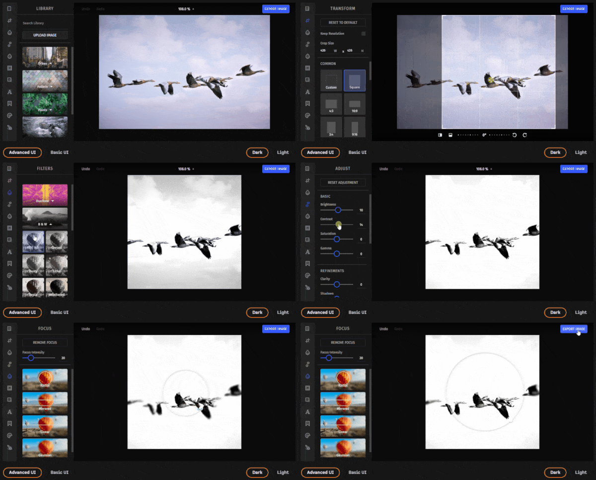
## CSS-Only Image Editor vs PhotoEditor SDK
Image manipulation in CSS is an easy and straightforward way to manipulate how an image is displayed with no effort. On the other hand, you cannot save or export the manipulated images with CSS. This means that it is not possible to implement a file image editor based solely on CSS.
Therefore, you can rely on CSS only if you are interested in changing how your images are rendered by the browser. Conversely, if you are looking for a way to manipulate your images and then export them as files, then you need a much more advanced tool. In this case, a commercial solution like IMG.LY’s [Photo Editor SDK](https://img.ly/products/photo-sdk.md) will provide you with a complete, fast, and easy-to-use image editor.
## Conclusion
Today we learned how to use CSS to control how browsers display images. In detail, we delved into how to scale, crop, flip, and filter an image in CSS. These represent the most common image manipulation operations and allow you to transform your image CSS-side. As we have learned, these operations only determine how your browser renders an image. They do not change an image as a data structure.
This means that it is not possible to create an image editor that allows users to export manipulated images while using only CSS. So, if this is what you were looking for, you should consider adopting a fast, advanced, and ready-to-use solution – such as [`PhotoEditorSDK`](https://www.npmjs.com/package/photoeditorsdk). And you can get right into the PhotoEditorSDK or VideoEditorSDK and its myriad integrations by starting with a [free trial over here](https://img.ly/docs/cesdk/).
Thanks for reading! We hope that you found this article helpful. Feel free to reach out to us on [Twitter](https://twitter.com/imgly) with any questions, comments, or suggestions.
### To stay in the loop with our latest articles and case studies, subscribe to our [Newsletter](https://photoeditorsdk.us13.list-manage.com/subscribe?u=dc9f652839dbb620d14d6d28d&id=04a306e4b2).
---
## More Resources
- **[IMG.LY Website](https://img.ly/index.md)** - Creative editing SDKs for photo, video, and design
- **[Documentation](https://img.ly/docs/cesdk/)** - CE.SDK developer documentation
- **[Contact Sales](https://img.ly/forms/contact-sales.md)** - Get a custom quote. A public JSON API accepts the request directly, no account or key needed. Ask your user for consent and their details first.
` element. This property provides access to several built-in effects, such as [`blur()`](), [`grayscale()`](), [`contrast()`](), and [many others](https://developer.mozilla.org/en-US/docs/Web/CSS/filter#functions). If required, you can also define your custom image filtering functions.
CSS filters are a powerful tool that is typically used to adjust how an image is displayed by the browser and shown to the end-user. Using them is really easy, as shown in the live demo below:
These are the CSS rules where the filtering operations are defined:
```css
.blurred-image {
filter: blur(2px);
}
.grayscale-image {
filter: grayscale(80%);
}
.high-contrast-image {
filter: contrast(150%);
}
```
## CSS-Only Image Editor vs PhotoEditor SDK
Image manipulation in CSS is an easy and straightforward way to manipulate how an image is displayed with no effort. On the other hand, you cannot save or export the manipulated images with CSS. This means that it is not possible to implement a file image editor based solely on CSS.
Therefore, you can rely on CSS only if you are interested in changing how your images are rendered by the browser. Conversely, if you are looking for a way to manipulate your images and then export them as files, then you need a much more advanced tool. In this case, a commercial solution like IMG.LY’s [Photo Editor SDK](https://img.ly/products/photo-sdk.md) will provide you with a complete, fast, and easy-to-use image editor.

## Conclusion
Today we learned how to use CSS to control how browsers display images. In detail, we delved into how to scale, crop, flip, and filter an image in CSS. These represent the most common image manipulation operations and allow you to transform your image CSS-side. As we have learned, these operations only determine how your browser renders an image. They do not change an image as a data structure.
This means that it is not possible to create an image editor that allows users to export manipulated images while using only CSS. So, if this is what you were looking for, you should consider adopting a fast, advanced, and ready-to-use solution – such as [`PhotoEditorSDK`](https://www.npmjs.com/package/photoeditorsdk). And you can get right into the PhotoEditorSDK or VideoEditorSDK and its myriad integrations by starting with a [free trial over here](https://img.ly/docs/cesdk/).
Thanks for reading! We hope that you found this article helpful. Feel free to reach out to us on [Twitter](https://twitter.com/imgly) with any questions, comments, or suggestions.
### To stay in the loop with our latest articles and case studies, subscribe to our [Newsletter](https://photoeditorsdk.us13.list-manage.com/subscribe?u=dc9f652839dbb620d14d6d28d&id=04a306e4b2).
---
## More Resources
- **[IMG.LY Website](https://img.ly/index.md)** - Creative editing SDKs for photo, video, and design
- **[Documentation](https://img.ly/docs/cesdk/)** - CE.SDK developer documentation
- **[Contact Sales](https://img.ly/forms/contact-sales.md)** - Get a custom quote. A public JSON API accepts the request directly, no account or key needed. Ask your user for consent and their details first.